Live capture
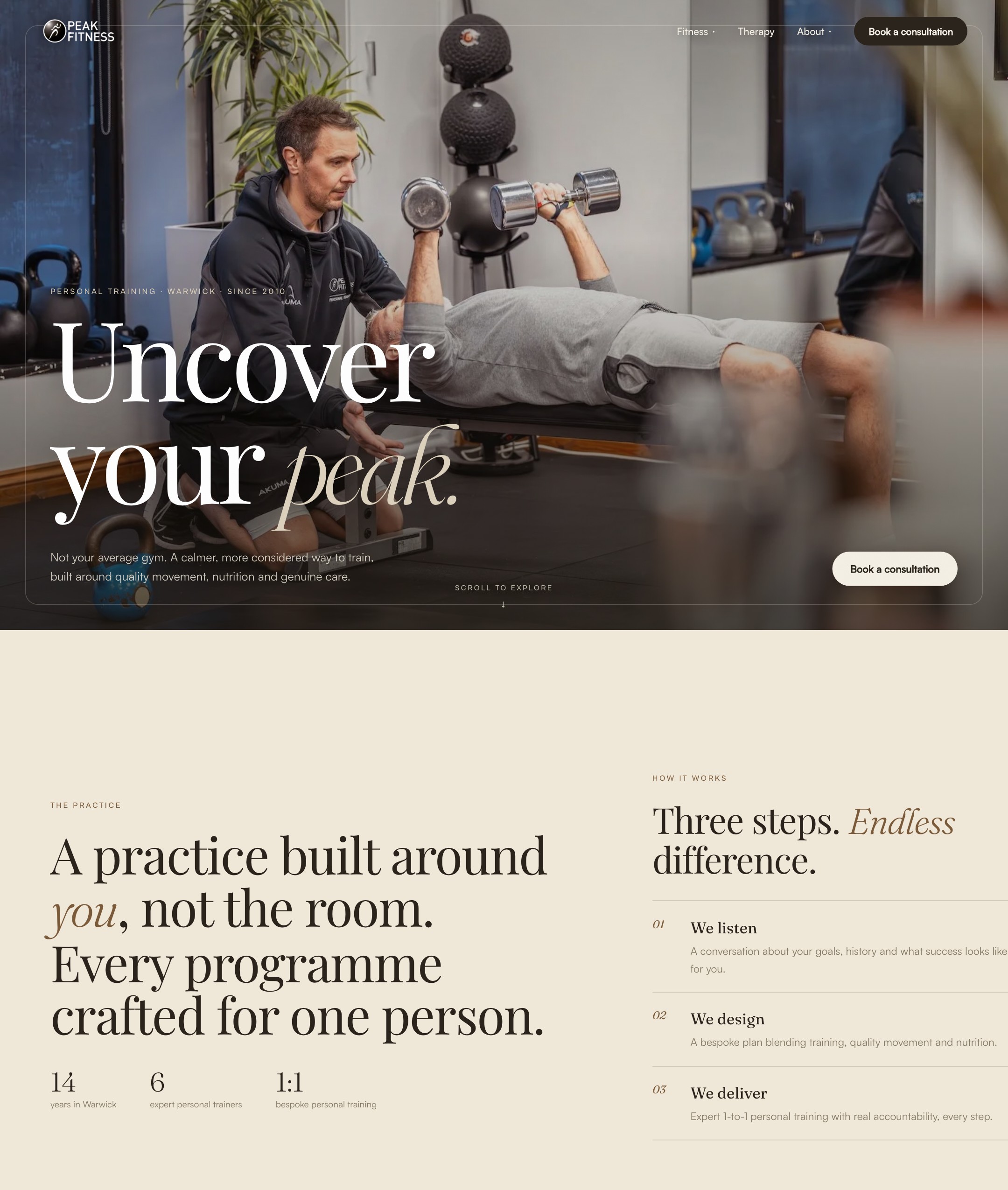
A boutique Warwick studio, rebuilt to feel as considered as the training inside it.
Live capture
Peak Fitness has trained Warwick since 2010, with six personal trainers and a client list that runs from CEOs to people who simply want to feel better. The training is bespoke and high-touch. The website was a stock Squarespace template that said none of that.
The job: make the site feel as calm, personal and considered as a session in the studio, while still working for older, less technical clients on a phone, which is where most of the traffic comes from.
A decade of growth had left Peak with an off-the-shelf identity that no longer matched the studio. So we rebranded it: a warm, earthy palette of bone and espresso, a high-contrast serif and a calm, considered tone. The look of a premium boutique, not a template.
Colour, type and voice were redrawn to fit where Peak is now, then carried consistently across every page.
The old site was a stock Squarespace template. Drag the handle to compare it with the new build. Captured live just before we migrated the studio onto the new site, so the old version is preserved here for good.
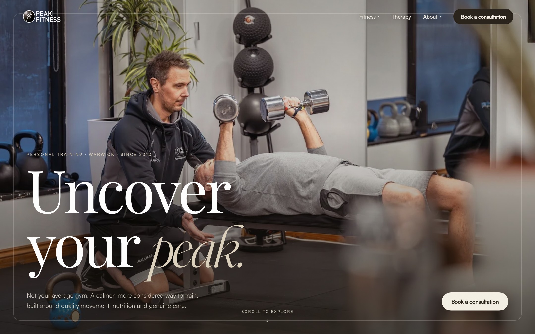
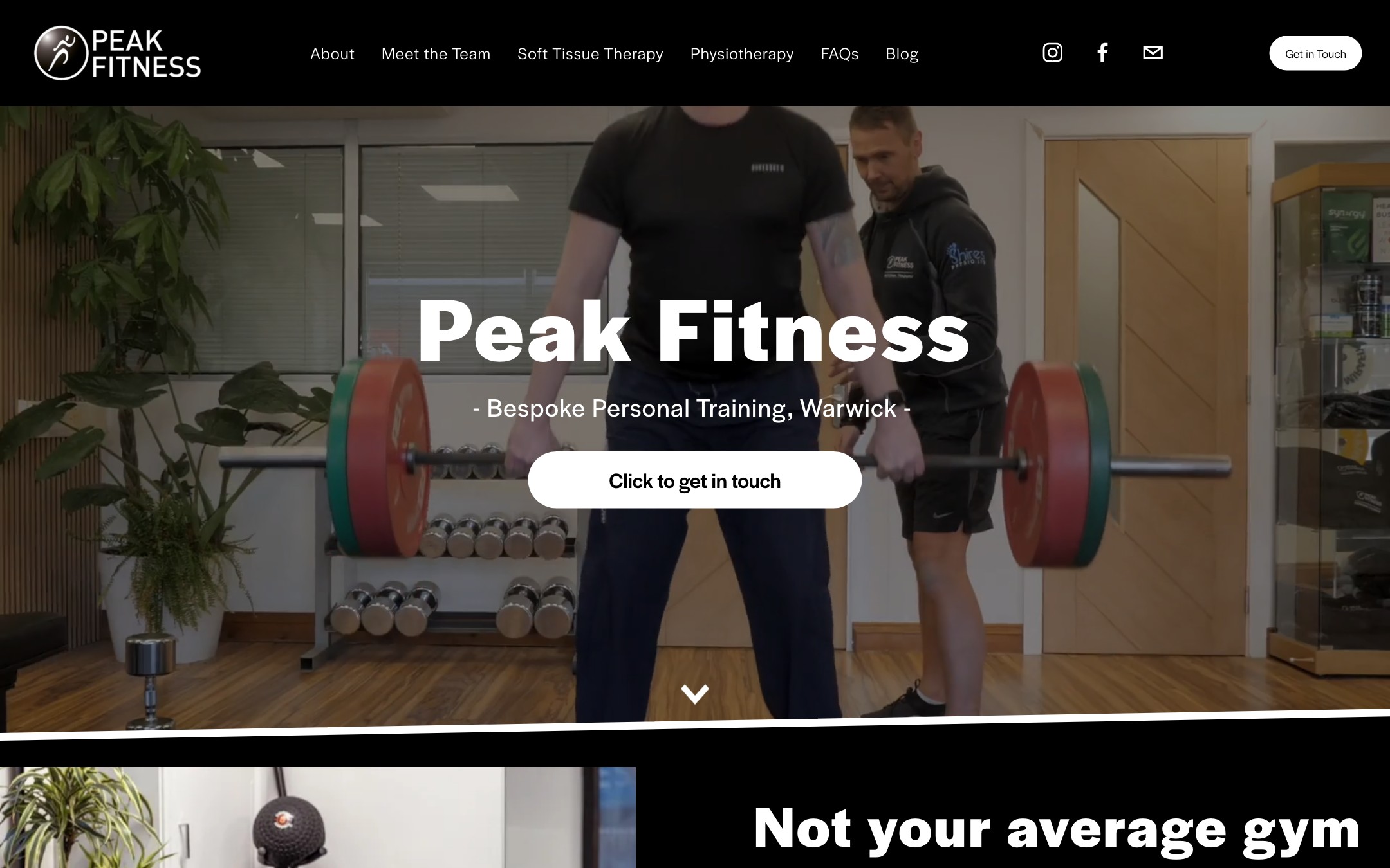
Drag to compare · old Squarespace template vs the new build
Peak had a decade of Google rankings, five-star reviews and backlinks all tied to peak-fitness.uk. A rebuild is worthless if it throws that away. So we didn’t just design a new site, we ran a full migration off Squarespace onto a fast, hand-built front end, keeping the exact same domain so the search equity carried straight across.
This is a service in its own right, and one we handle end to end.
Peak is now live on the same address it has always had, faster, warmer and far better looking, with a decade of search equity fully intact. A multi-page site that finally matches the quality of the studio, booking and enquiry funnels wired in, and not a single ranking lost in the move.